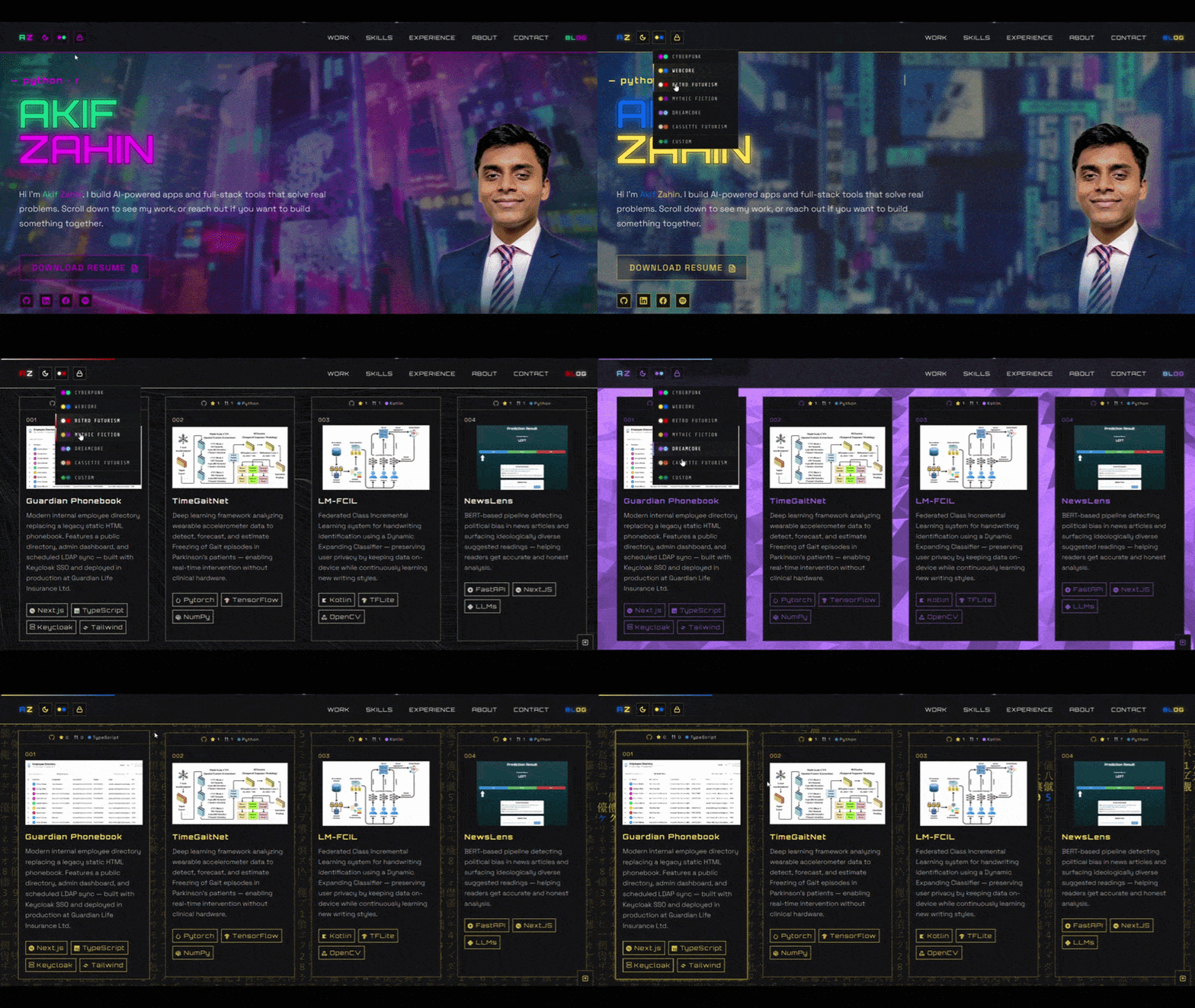
 A short GIF of the website's theme switcher in action
I'll be honest, I have no idea how this project got here. Well, kind of.
I started by trying to build a small and simple portfolio website. Four weeks later, I ended up building a personal website a CMS, authentication, comment moderation, auto-save, cloud storage, blog publishing, 3D animations, and enough back-end code that calling it a normal portfolio website felt wrong.
Let me take you through the journey of how this project came to be.
Starting slow and steady
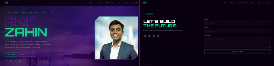
First version of the hero and email form section, built as the starting point
The initial version of this website started out as nothing more than a hero section, sections to show my work, experience, skills etc, a cool picture I took back in Cox's Bazar and a small section to email me at the end. That was the baseline I stuck to as I kept building upon this website. The goal was simple: Showcase my portfolio cleanly laid out in a user-friendly and good looking website.
Getting inspired by many of my peers in the same path, I had built this working baseline within a few days, ironing out the ideas and building them with the help of Claude, as it proved to be critical in finding out different view points for what I had imagined and what could actually be created and what users or potential recruiters would actually enjoy looking at.
But as days went by, I became unsatisfied with 2 critical things:
Lack of animations with an undetermined color scheme
Lack of a blog creation system
My website lacked the "wow" factor, something that had screamed that this was me. Anybody can use AI and create a basic portfolio website. Add a few prompts, tweak some styles and voila, a website that anybody can build within a few hours. But the difference between someone who has "vibe-coded" (a relevant term for today's coding world created by Andrej Karpathy) a website vs someone who has spent a dedicated portion of their time in creating and expanding upon a basic idea is decided on how unique it is from other candidates.
If you built the next Facebook and asked someone to care about it, it doesn't matter how many hours you spent creating it, it is still an idea that has been well established and tested. The only way for users or potential recruiters to even look toward your direction would be to add something that even Facebook hasn't thought of themselves.
So that's exactly what I started doing. Planning on how to add animations and create an... entirely new blog writing system. Yikes.
Lack of animations with an undetermined color scheme.
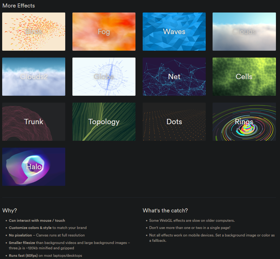
The Vantajs website showing all available custom animations
When you start creating a website and adding your own styling, it can quickly get overwhelming to add new and difficult rules. If you want a modern and beautiful looking website, you have to be prepared to create a styling sheet that may be hundreds of lines long. But once you go down that path, your website becomes something of an art canvas, ready for you to paint according to your style, no matter the complexity. I then discovered the website Vanta.js; a beautifully crafted animation library that gave prebuilt Three.js animations for anyone to copy and drop in their website.
This was an amazing find as the task of learning Three.js from scratch, implementing what I wanted and then meticulously weaving it into my website's body would take months of learning and trial and error. But implementing this library into my own code was challenging to say the least, because the "Theme Picker" button on the Navbar would have 5 different options (+ a custom color picker) with preselected aesthetics that would:
Change the html body to a preselected Vanta.js animation, styled to my chosen color pair.
Change the hero image
Switch between color schemes (a color pair chosen by me)
Therefore, If the user clicked the option "Retro Futurism",
The HTML body would change to TOPOLOGY, styled with Red and White
The hero image would change to a retro futuristic image
The colors would switch to red and white where white was chosen in light mode and red in dark mode. (the GIF above shows the complete flow of my vision)
Three bugs in particular stand out from those weeks.
The first was a stale closure — switching themes and then hitting dark mode would sometimes apply the previous theme's colors instead of whatever option the user had chosen. The culprit was a const holding the theme name, captured once when the page loaded which never got updated. I spent hours assuming the bug lived somewhere in Vantajs' animation code before realizing it was sitting in my own state management the whole time.
The second came from handling the Vantajs animation. Switching between animated backgrounds, the background would sometimes end up with two effects stacked on top of each other. The animated Vantajs backgrounds own destroy function doesn't always clean up fully after itself, so the leftover canvas just sat there in the background.
The third one wasn't really a bug, more a lesson in how Astro's page navigation works. I was using a feature called ClientRouter, which swaps pages without doing a full browser reload, making the whole site feel fast when you click around. But that speed came with a catch: as the page never actually reloaded, anything that persisted such as the animated background had to be manually shut down and restarted every single time someone navigated to another page. Without it, you'd get a background that just stopped responding.
Lack of a blog creation system
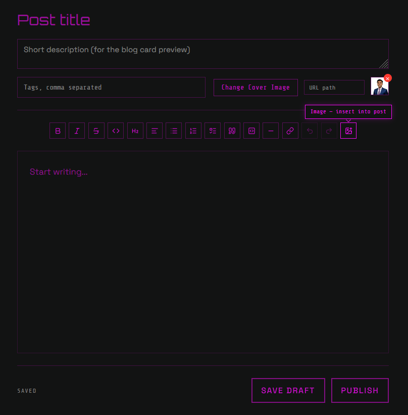
The first working version of the custom styled TipTap editor
After going through a couple of personal losses in my life, writing became one of the key foundations in expressing my thoughts, whether it was on any personal topics or the technical details about my projects. I had primarily written a few blogs on Medium, which was a great beginner platform to get my thoughts right out to an audience.
I loved the writing experience in its editor and the community that came along with it, but the posts themselves existed only on Medium's servers. I wanted autonomy over where my writing lived, and the chance to build an audience under my own domain instead of someone else's.
So I set out to build a Content Management System, mirrored loosely from Medium, where an admin login would grant me access to a drafts page showing everything I'd published or was drafted — all stored in Turso, an open-source, SQLite-compatible database with very fast loading times, and editable through a custom-styled TipTap editor from anywhere, my phone included.
The CMS has made writing an immense joy. The on-the-fly saving and publishing reduced the friction to publish something easily from my brain to my website.
Building the CMS itself
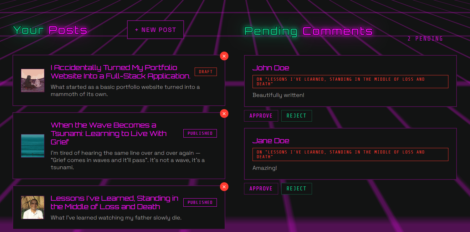
The drafts page showing all drafts/published post along with unapproved comments
The CMS came together in layers, and each one solved a different problem on its own:
Storage — Turso holds a single
poststable for everything I write, in draft or published form, along with the metadata which renders on the dashboard.Auth — a single admin password thats checked against an environment variable issues a signed JWT session. No user accounts, no OAuth, no password reset flow as there's only ever one person logging in.
Editing — TipTap, styled from scratch to match the rest of the site, with autosave running quietly in the background as I type.
Media — cover and inline images upload straight to Vercel Blob, a simple file storage service from the same platform I'm already deployed on.
Publishing — a single toggle flips a post between draft and published which was the same experience I was trying to recreate under my own domain.
Each of those pieces was small enough to build in isolation, but stitched together, they're what actually makes the dashboard I log into today, feel like a real CMS instead of a form that writes to a database.
Bringing readers into the loop
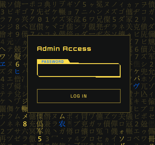
The admin login page to access the posts and comments
Once the CMS went live, the next piece was giving people a way to write their thoughts. The system is simple: anyone can leave a comment on a published post, but nothing goes public immediately. Every comment lands in a pending queue first, visible only to me from the admin dashboard, where I can approve it or reject it. Replies are auto-approved from the blog post page, since I'm the only one replying. Adding replies from other users would create another database headache (which I would get to later)
There's no login required to comment, which meant I needed another way to track who'd interacted with what. I leaned on the same trick as the clap feature, a UUID generated client-side and stored in localStorage, so a visitor can like a comment, or have their earlier like remembered on a return visit, without ever creating an account. It's simple, but it's the difference between just a writing post and a place where users can discuss what they read.
Right next to comments sits the clap button, a small Medium-style like button that you can click-and-hold to keep clapping, capped at 50 per visitor so it stays a genuine reaction instead of something that can be spammed into meaninglessness. It uses the same localStorage UUID trick as the comment likes, so no accounts, no friction, just a quick "+1" pop and a number that goes up.
What's next
This first version is currently live, but the site is something more of a canvas that I will keep adding to. In the future, I want to finally sit down with Three.js properly instead of borrowing Vantajs' presets.
Closing thoughts
I am still shocked at how three months have passed on this project. What started as a resume with a nice hero section turned into its own small product, with its own auth, its own database, its own comment system. It's mostly about having the passion to not stop until your creative aspects are fully satisfied and then finding more inspiration to add more features. Somewhere along the way, I stopped making a portfolio and made my own corner of the internet.
Share Your Thoughts!
Comments
Loading comments...